
Why Print Colors Differ From Your Screen
Printed colors on a shirt almost never match exactly what you see on screen, because the two make color in opposite ways: a screen emits light (RGB), while ink absorbs light (CMYK, plus white ink when printing on colored shirts). The range of colors ink can reproduce is narrower than what a screen can display, fabric absorbs and spreads ink differently from paper, and every screen shows color a little differently. The usual result: printed colors look softer and less vivid, especially neons.
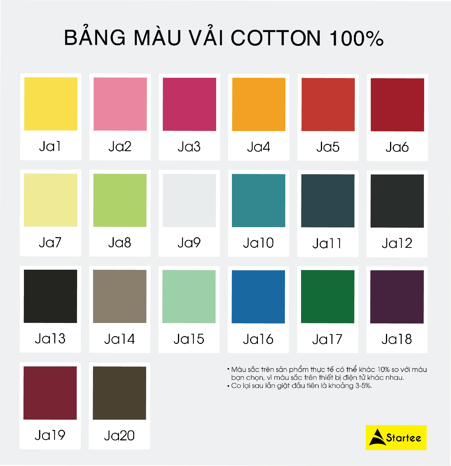
Startee even notes this on its own fabric color charts: colors on the finished product may differ by around 10% from the color you picked, because electronic devices display color differently. This guide explains why, which colors shift the most, and what to do to get the print as close as possible to what you intended.
How RGB and CMYK differ
- RGB (red, green, blue) is the color of light: a screen adds these three lights together — the more, the brighter, and all three make white. Phones, computers and camera photos all work in RGB.
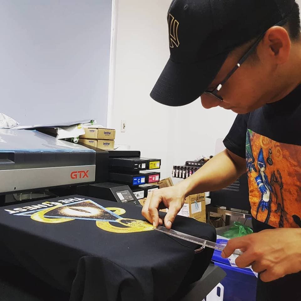
- CMYK (cyan, magenta, yellow, black) is the color of ink: ink absorbs light, so the more ink you layer, the darker it gets. A DTG printer jets dots of CMYK ink, and on dark shirts it first lays down a layer of white ink as a base.
- Because the mechanisms are opposite, some very bright, saturated RGB colors have no matching ink color — the printer has to use the closest color it can print.
Five reasons printed color shifts
1. The color is outside what ink can print
Electric green, electric blue, bright purple, neon pink and neon orange are easy for a screen and out of reach for ink. When printed they’re replaced by the nearest printable color, so they look duller. That’s a limit of the ink, not a fault of the printer or the workshop.
2. Every screen displays color differently
The same file looks different on a phone, a laptop and an office monitor, depending on the panel, brightness, night mode or battery saver. The color you approved on your phone may already differ from what the designer saw on their computer — before printing even starts.
3. Fabric isn’t paper
Ink soaks into the fibers and fabric has texture, so color on a shirt usually looks softer than the same color printed on glossy paper. 100% cotton takes DTG ink best; polyester-heavy blends color less accurately with DTG — see 100% cotton vs CVC/TC blends.
4. The shirt color underneath
Printing ink is slightly translucent, so the shirt color affects the print. On dark shirts DTG needs a white base layer for colors to come out right; even with it, a design on a black shirt usually looks a little different from the same design on white. Grey and pastel shirts also pull the print’s colors toward them.
5. The printing technique
DTG builds color from dots of CMYK ink, so it prints photos and gradients but stays within the ink’s color range. Screen printing mixes each ink color separately, so flat areas of color usually come out more solid, saturated and consistent. Heat transfer vinyl uses pre-colored sheets, so the color depends on the vinyl colors available. See DTG vs screen print vs heat transfer vs vinyl.
Which colors shift most, and what to do
| Color group | When printed on a shirt | What to do |
|---|---|---|
| Neon, electric green, electric blue, bright purple | Noticeably duller and less vivid | Pick a slightly less saturated shade; if it must be vivid, ask about screen printing or specialty vinyl |
| Very dark, near-black areas in photos | Tend to clog and lose detail | Lighten dark areas slightly before sending |
| Light and pastel colors on dark shirts | Depend on the white base, can shift slightly | Check a mockup on the right shirt color and print one test piece |
| Brand colors and company logos | May shift enough to notice | Send the color code, print a sample and approve it by eye before a bulk run |
| Neutral and medium-dark colors | Usually the most stable | Still worth checking a real sample for a large order |
How to get print colors closest to your design
- Design in standard sRGB and avoid neon colors unless you really need them. If you send a CMYK file, tell the printer so it isn’t converted twice.
- Don’t choose the shirt color from a screen. Look at a real fabric color chart at the workshop, or ask for fabric samples if you’re far away.
- For logos and brand colors, include the color code (HEX, plus a Pantone code if you have one) and ask which printing technique matches it most closely — for flat areas of color, screen printing is usually the first choice.
- Print one test piece or request a sample before a bulk order, and judge the color in daylight.
- For photos with lots of dark areas, lighten those areas slightly before sending so they don’t clog.
What a screen mockup is for
A mockup lets you check a design’s position, size and overall look on a shirt — hard to picture from the file alone. But it’s still shown on a screen, so it can’t replace a physical sample when you need to lock in an exact color. You can build one free with the online design tool, then confirm color with a sample.
How Startee helps you lock in color
- A real fabric color chart with 40+ cotton colors, so you pick the shirt color by eye, not on a screen.
- No minimum order for DTG, so you can print one test piece to approve color first.
- For uniform orders, a free sample is sewn before bulk production so you can check fit, fabric and print.
- Dark shirts get a white base layer so colors print more accurately.